How to Choose Colors for your Brand
“I’ve been racking my brain, trying to come up with colors for my brand!”
I get it, girl! We’ve all been there in the first part of our branding journey.
Before you call it quits…Remember your brand colors will change over time. You will find what will work for you. I’ve changed from having a really colorful brand of pinks, yellows, blues, and orange to a peaceful feminine vibe featuring shades of blush! It took me a while to figure out what would really work for my brand. How my audience will feel with these colors. Plus how it would fit in with my personality as I’ve grown over the years.
We know consistency is key so I want to help you take the guess work out of picking colors for your brand with these simple tips and tricks !
By choosing your brand colors you can then create consistency in the stock photos you use, graphics for your brand, plus in your logo, and all throughout your website.
“Before I began, I thought about how I wanted to make people feel. That feeling I kept with me when I decided to rebrand my business. ”
Love it, Pin it!
Share this post with your audience so they can take the guess work out of choosing colors for their brand!
Different Colors Evoke different emotions
*Colors have many different shades to them this is simply an overview of what each color signifies.
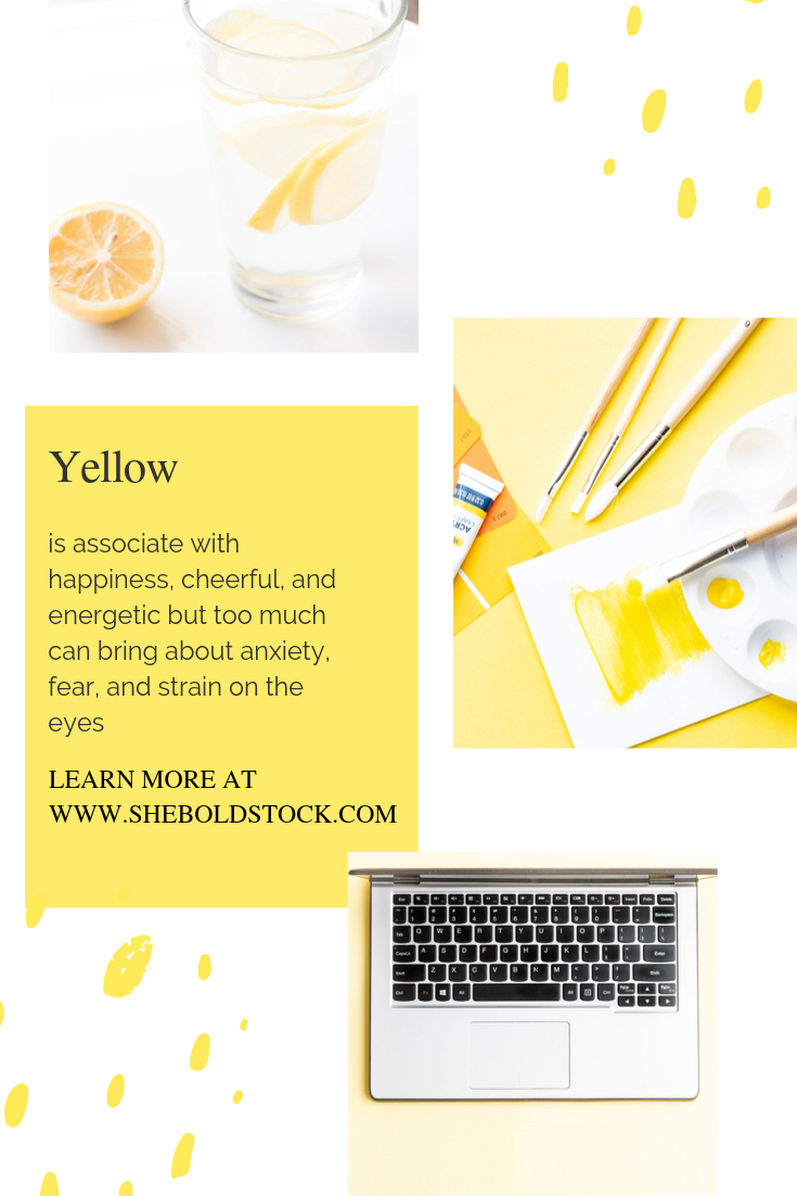
Yellow is associate with happiness, cheerful, and energetic. Perfect to give the feeling of confidence, energy boost, or inspire. Avoid using too much yellow as it can bring about anxiety, fear, and strain on the eyes. Keep yellows for call to actions or sales to grab people’s attention.
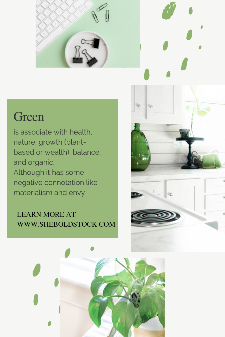
Green is associated with health, nature, growth (plant-based or wealth), balance, and organic. It often relieves stress. Although it has some negative connotation like materialism and envy green is a great addition to add to a brand.
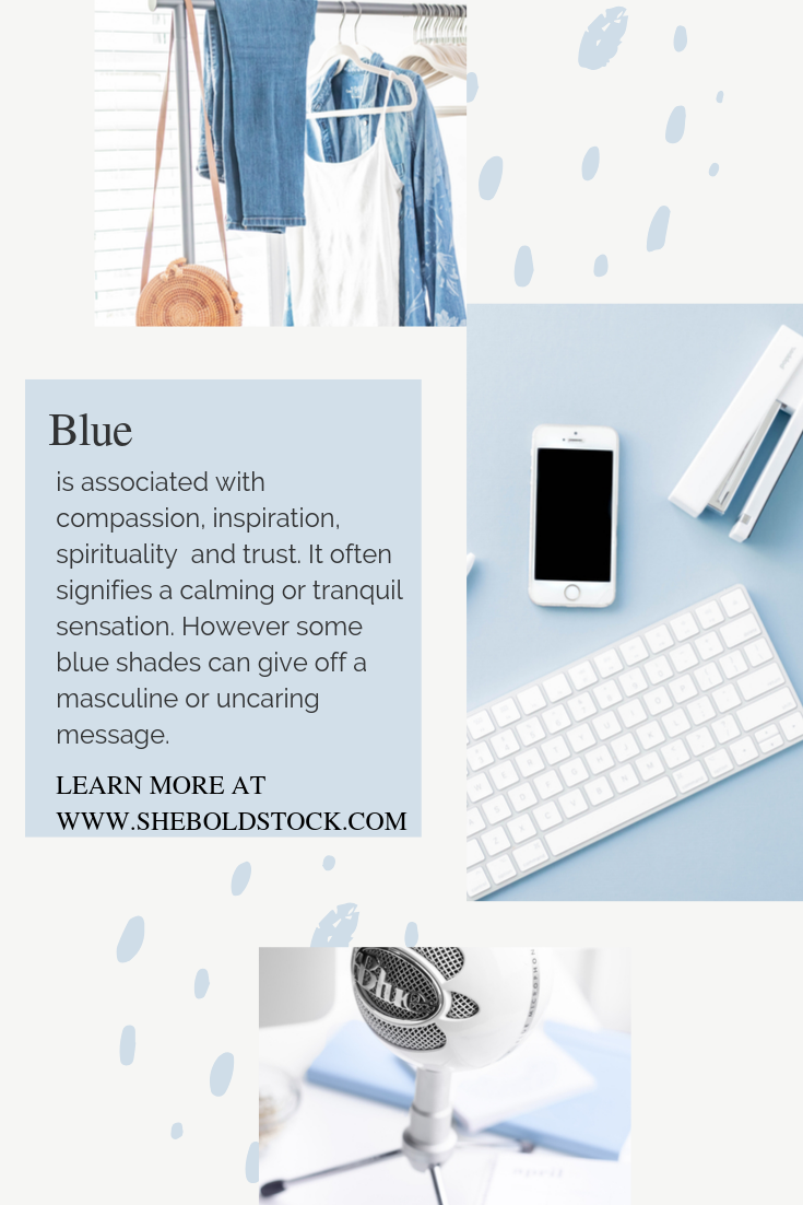
Blue is associated with compassion, inspirational, spirituality and trust. It often signifies a calming or tranquil sensation. However some blue shades can send a masculine or uncaring message.
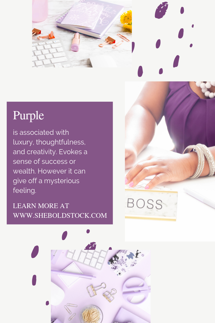
Purple is associated with luxury, thoughtfulness, and creativity. Evokes a sense of success or wealth.
Red is associated with love, passion intensity. It energizes the senses and makes people feel motivated, determined, and courageous. A bold color that should be used minimally due to it being seen as hostile if used too much.
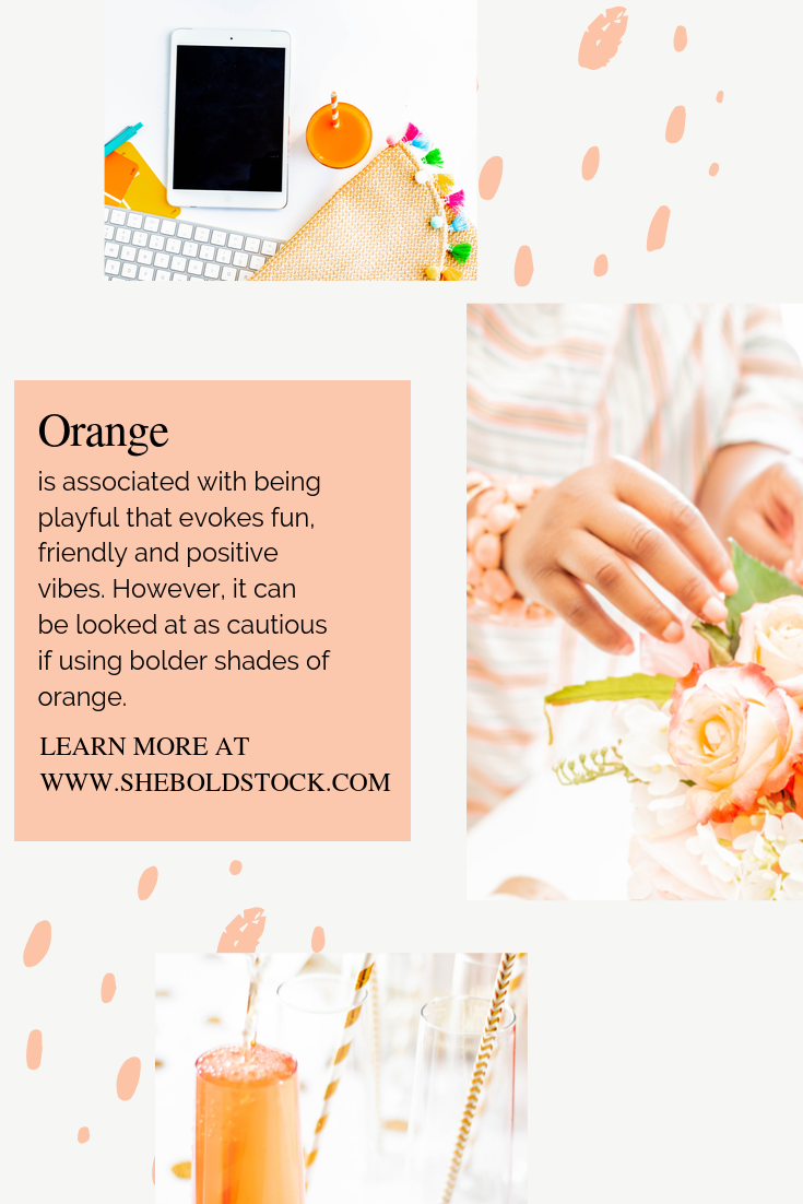
Orange is associated with being playful that evokes fun, friendly and positive vibes. However, it can be looked at as cautious if using bolder shades of orange.
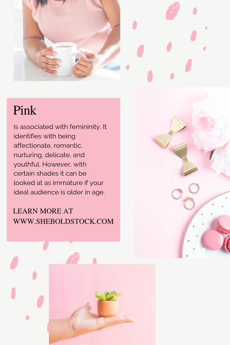
Pink is associated with femininity. It identifies with being affectionate, romantic, nurturing, delicate, and youthful. However, with certain shades it can be looked at as immature if your ideal audience is older in age. Often overused in feminine brands and has been labeled as pink-washed by many who do not like the color.
White is associated with pureness and renewal. Simple, clear, spacious and and often considered sophisticated in nature. However, it can be seen as distant or cold.
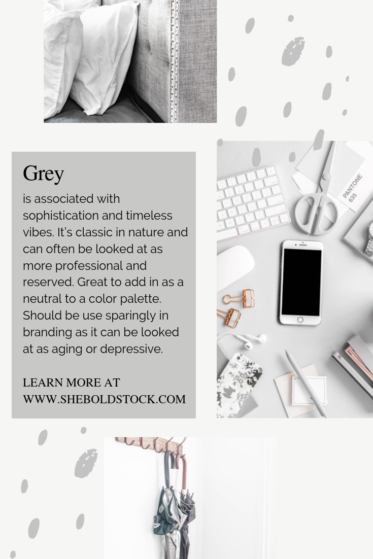
Grey is associated with sophistication and timeless vibes. It’s classic in nature and can often be looked at as more professional and reserved. Great to add in as a neutral to a color palette. Should be use sparingly in branding as it can be looked at as aging or depressive.
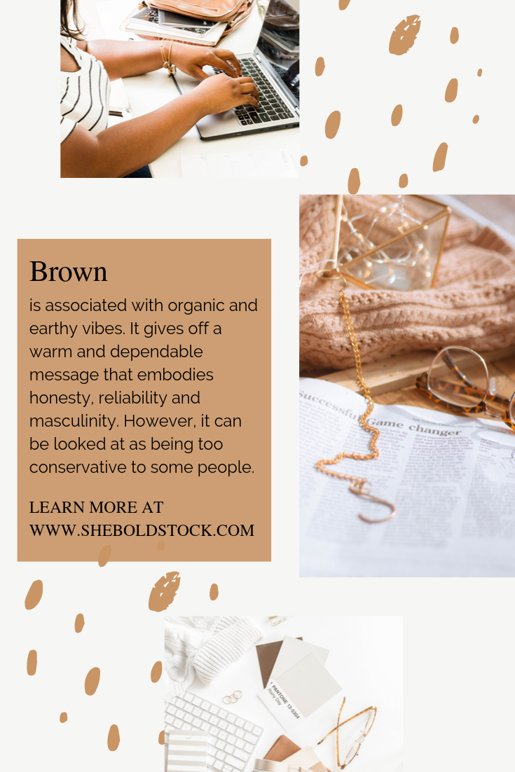
Brown is associated with organic and earthy vibes. It gives off a warm and dependable message that embodies honesty, reliability and masculinity. However, it can be looked at as being too conservative to some people.
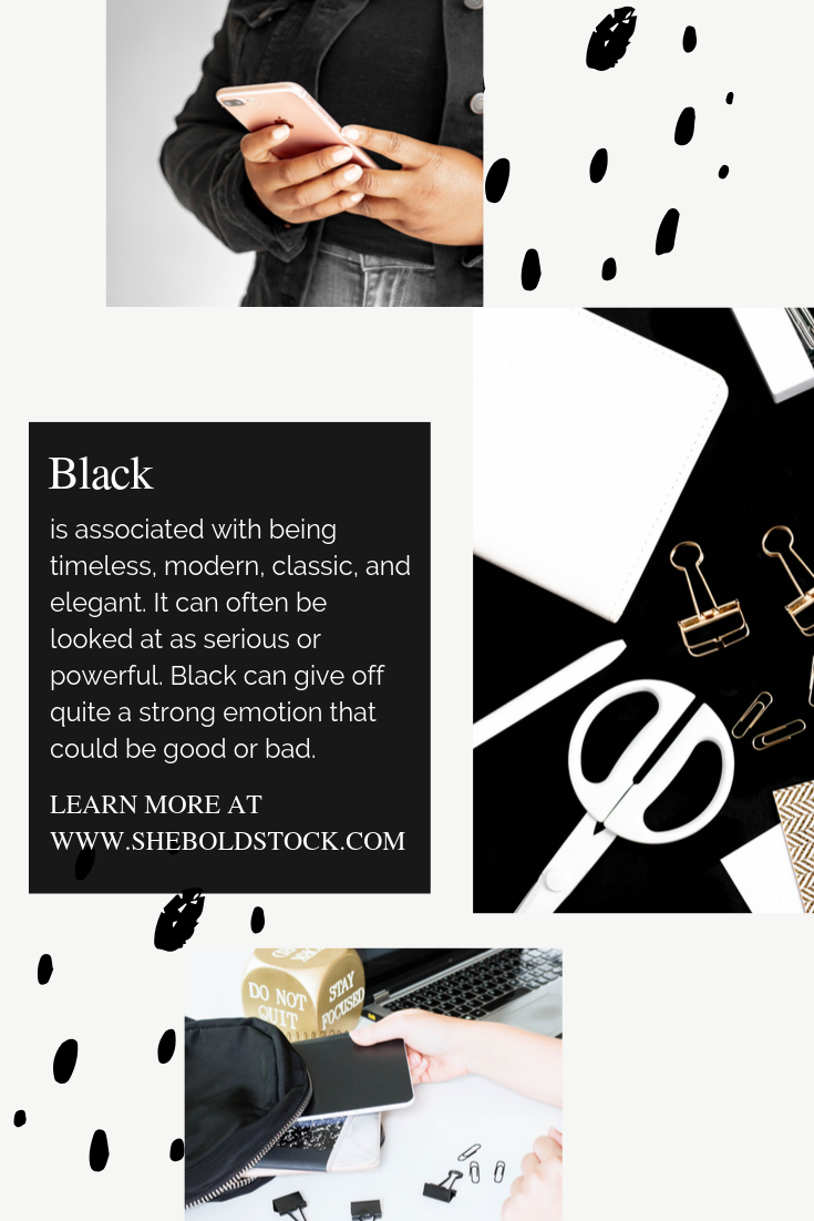
Black is associated with being timeless, modern, classic, and elegant. It can often be looked at as serious or powerful. Black can give off quite a strong emotion that could be good or bad.
Here’s a Quick overview of each color
A Quick Vocabulary Lesson:
There are so many different color schemes you can choose from so I want you to get acquainted with a few definitions to help you decide!
Complementary - a complementary color scheme consist of opposite colors from the color wheel
Monochromatic - a monochromatic color scheme consists of different shades and depths of a single hue.
Analogous - an analogous color scheme is a main color and the colors from either side of it on the color wheel.
Creating the Perfect Color Scheme
So you’ve seen what the colors mean. Now it’s time to start creating a palette, however, before we get into that let’s look back at the foundation of your brand. Here are a few questions I want you to think about first if you haven’t already:
What do your brand stand for? I’m talking about your core values and beliefs. Do you believe in hardwork, fun, authenticity, balance, creativity, faith, growth, happiness,etc. the list literally can go on and on. But come up with at least 5 core values that your brand stands for. These values need to show through the way your brand speak, the way your brand looks, and how you deliver your brand to the world.
How do you want your ideal audience to feel? I’m talking about emotion. What emotions do you want to evoke in your audience to get a response. Do you want them to be happy, inspired, included, educated, etc. You want them to be emotionally inclined to learn more about you. Pick 3-5 emotional words!
*If you haven’t already seen the video check it out above!
What is your brand’s personality related to you and your ideal audience? Now putting it all together. What personality and voice do you want to portray with your brand. Your brand’s personality is really who you are. If you aren’t bubbly and inviting…don’t act like it! People will see right through it! You are your brand unless you have a team behind you then they are your brand as well, so if you are reserved, professional, and have core beliefs like leadership or respect showcase that in your business and don’t feel bad about it. Remember this will draw your ideal audience.
Coming up with the Perfect Color Scheme
When it comes to creating a color palette you first want to look at where you’ll be using them. Choose 3-5 colors that will compliment each other well, can be a challenge. However, here’s what you need to consider when deciding on the perfect color scheme.
Choose a bold color that will represent your brand really well and grab the persons attention. Often used as buttons or attention grabbers for sale graphics.
Choose a color that compliments the bold color. This can be a color that compliments or contrast. Try looking at this color wheel for understanding or what is complimentary and what is contrasting.
Pick a neutral color that will pair perfectly with both colors. This helps to ground your bold and complimentary color.
Add on Accent colors:
4.Pick a dark color that will be used in your paragraph text. It needs to be readable.
5.Pick a light color that will be used for backgrounds and in supporting elements. It needs to look good behind your other colors.
3 Ways to choose your Brand Colors
Choose a color palette from other brands
Check out what brands in your niche are using. Check out what brands outside of your niche are using. How does these colors make you feel. Write down a couple of businesses and how they make you feel. Don’t try to copy one business. Instead focus on finding inspiration. How does these businesses make you feel, are they using their colors in away that aligns with their audience, check out their about me page to see what they believe in, what makes them successful. Take notes on all of this and then formulate a color scheme that will resonate with your brand.
2. Create an inspiration Board
Once you have your foundation an inspiration board is a great way to choose colors.
Create a secret brand board just for your business. Start pinning images that resonate with you. Don’t over think this process. If you find something your ideal audience would resonate with, pin it. Find patterns, textures, words, icons, and of course photos. Think “how do I want my ideal person to feel when looking at my brand?“ Do I want them to be inspired, empowered,included, motivated, happy, elevated, etc.
Pin up to 30 images and then stop! Walk away from it for an hour and then come back to it. Do it still resonate with you and your ideal person?
Get rid of images that aren’t fitting to your brand. Are you seeing a pattern in colors? If so take note of that.
Download the images that are left and put them in a mood board. Take a deep look at them and see what is popping out to you. Are there any recurring colors?
Extract the colors in a software that generates the hex codes for you. *See below
Pick 3-5 colors from those extractions.
1Bold Color > 1Complimentary Color to the Bold color > 1Neutral Color > 1Light Color > 1Dark Color
If you are having trouble figuring out what colors go with what, check out this article on Color Theory!
3. Choose a color Palette from a photo
Fell in love with a color scheme in a stock photo? Why not extract those colors and use them! You can do this several ways but I have 3 main color pickers that’s free and straight from the internet. Simply upload an image and start choosing your colors.
Adobe Color allows you to pick and choose the colors you want. Perfect for those that want to pick and choose the color of their choice.
Canva Color Picker is simple where it automatically takes the colors from the picture to give you a color combo. Perfect for those who just want a color palette quick and simple.
Image color Picker also a great choice and similar to Adobe Color but simpler. You’ll be able to click anywhere on the image and choose the color that best fits your brand.
Write the hex codes down on your phone and in a notebook where you keep your brand identity notes. This will help when designing for your brand. Keep your hex codes and color palette in front of you when you are creating for your brand whether it’s find stock stock, changing the colors or stock photos, creating templates for your brand, etc. Think where will you add your colors on your website…Your headers, body of text, links, buttons, navigation bar. Where will you add them in your social media…graphics, covers, aesthetic for instagram, etc.
In Conclusion
Choosing your Brand Colors involve:
Building your brand foundation first by knowing what your core values and beliefs are, how you want your ideal audience to feel, and what personality you want to portray.
Having some knowledge of what colors mean to help you create emotion in your brand.
Next figure out the color scheme that will work best for you. Do you need 3 or 5 colors? Think about where you will you need to use these colors. Do you want or need variety?
If you are looking for 3 ways to choose brand colors look no further than pinterest, stock photos, and other brands for inspiration.
Building consistency through color will definitely help you stand out but remember things could change over the course of your business. You’ll find colors that will resonate with you more. Your brand values could change. Your ideal audience could change. Your knowledge of branding could change all together.
